Tuesday, December 29, 2009

Pining for the Bach


The "bach" Marlborough Sounds, New Zealand

This title will mean little to you unless you happen to hail from the same part of the world as I.  A bach in New Zealand is the name for a small holiday house.  Sometimes known in Australia as a shack, in Southern New Zealand they say a crib and I'm sure around the world there are different names for the same thing.


The bach seems to be falling from favour replaced by the multi-bathroom holiday house but nothing will replace the bach in my heart.


This summer we are staying put here in Melbourne and I feel a little sad.  My Christmases and summer holidays were spent as a child on the Kapiti Coast north of Wellington in New Zealand in a bach.  A collection of old army huts.  One hut was the kitchen and tiny living space ajoined by a covered walkway to the second which housed my parents and our bedroom separated by a curtain. The bathroom was primitive a basin and old shower, and the toilet was a very no frills affair - no flushing toilet here.  Rain was collected from the roof for drinking and other water supplied by a pump which frequently broke down and that my father seemed to repair by smacking with a hammer and swearing while being bitten alive by mosquitoes.  Fond memories indeed!


Alas alack my family now no longer has a bach but fortunately my partner's family do - in the Marlborough Sounds (pictured above) this too is a one roomed affair - sleeping up to 8 with two sets of bunks and a small fold out couch.  It is reached by a nausea inducing drive on windy gravel roads (sometimes the topography of Australia is sheer relief).


What on earth has all this to do with garden design you may well ask but my summers at our bach was my introduction to the world of plants.  I remember the plants so clearly - their location and their contribution to my world.


There was the red salvia next to the sandpit which we greedily sucked the nectar from.  The lemon tree fuelled by horse manure.  The walnut tree that was somewhat stunted by unsuitable sandy soil but was a lovely shady retreat and where I hung my hammock that I received for Christmas one year (but was plagued by aforementioned mozzies).  The feijoa hedge (pineapple guava) which was not terribly good at fruiting but we nibbled on the delicious flower petals.  The dreaded pampas grass which we delighted to play in despite it cutting us to shreds every time.  My father's broad beans which were never picked early enough and we ate with some despair.  The wattle tree which had sticky sap and brush like lemon flowers and cracking seed pods - all good for various games of imagination.  The lupins with their yellow flowers.  The poplar trees in the "dell" where my father pointed out to me a fairy's house - an upturned birds nest with a mushroom for a chimney (this lives in my memory but what is real and what is imagination I can no longer tell).


Now when we retreat we head to D's family bach.  He has similar summer memories although I think plants feature less prominently for him - the land had previously been farmland and grass and gorse were the main features. Not so now - ironically due to the land being used for forestry - the protection these trees has afforded has allowed the native bush to regenerate in pockets and so with the return of the bush has been the return of the birds.

So with that thought of regeneration I wish you all a very Happy New Year for 2010 - thank you for visiting and for your thoughtful comments that raise my spirits all year round.


Monday, November 23, 2009

Clinging and Creeping


I was lucky enough a few weeks ago to take a little jaunt out to Daylesford a small spa town west of Melbourne.  A lovely 24 hour escape from the usual hurly burly of life with a good friend. While I was there I came across these very well thought out fixings for climbers which complement the canopies and masonry structure of the buildings beautifully.  

I'm always delighted when I find something that is so well thought out ... the metal rods not only sit around the top of the canopies but are tucked within the masonry meaning that in time the plant can be trained (in the case of the rose) or will creep naturally along indents in the masonry.


It also is a good reminder that very little space is needed to plant something wonderful ... the planting spaces cut into the pavement were barely more than 10 x 10cm square.  I'm sure someone is a dedicated waterer but still ...


Back in Melbourne I came across this climber in the courtyard of a cafe.  And yes it is creeping up the frame of an old inner sprung mattress.


Also in Melbourne simple but effective - reinforcing mesh mounted on a brick wall.


And earlier in the season just around the corner from where I live my very favourite wisteria vine.


Friday, October 2, 2009

Natural Wonders


Flowering Grass Trees, September 2009 Wilsons Promontory National Park


I've just returned from a family expedition to Wilsons Promontory - at the very southern most point of Victoria.  We stayed close by to Wilsons Promontory National Park and made a day outing to the park.

During last year's fires a large portion of the park was decimated by fire which started from lightning strike.


Like many things in life it is often when they are taken from us that we appreciate them all the more.  The most amazing regeneration is taking place in the park.  One of the most spectacular is the flowering of the grass trees.  This is most likely to take place after fire and while they send up there flowering spikes (usually brown) it is often only after fire that they flower prolifically.  And in fact in areas protected from fire they are unlikely to regenerate without these conditions (Ward & Lamont).


The beauty of the regenerating landscape is quite astounding.  In this area of the park from what I could tell the flora was primarily Coastal Banksias and Grass Trees.  The Banksias are shadows (however the fire has opened their seed pods and they will regenerate) with the Grass Trees taking centre stage with the magnificent background of the granitic peaks.  


Further on stands of eucalypts were regenerating in their rather magnificent fashion of shooting out from the trunks and larger branches making them look as if they were covered in creepers - I haven't a photo here as there is only so many times you can make the whole family stop while you take photos of your niche interest! However the Wilson's Promontory Parks website has photos of the regeneration which are very interesting.
 
At the Tidal River camping ground the main flora was stands of tea tree (immersed in water in swampy ground).  Aaah nature - you are the best designer of all.


Wednesday, September 9, 2009

Vertical Web Wanderings

Vertical Display at Flora Grubb

The thing I love about the Web is that it opens my world to many things that would otherwise simply be out of my physical reach.  One of these is the San Francisco based Flora Grubb Garden Store.  They seem to have the most gorgeous displays of plants and garden accessories.  

One of my current favourites that they have on display is something called "Wooly Pockets" not the best name you would agree but seemingly a rather delightful low investment vertical garden.  Designed as a simple modular system for creating a vertical garden for inside (waterproof) or outside.  Even better they are made from recycled plastic bottles which has to be a good thing.   
Other vertical delights featured at Flora Grubb include those using succulents and a fantastic use of tilandsias. I highly recommend you hop over there for a look whichever way is possible (physical or metaphysical).


Saturday, August 29, 2009

Dreaming of Water

Melbourne's Royal Botanic Gardens

A couple of weekends ago I walked around the Melbourne's Royal Botanic Gardens for the first time in quite some time. I was devastated by the impact of drought on these gardens - the gardens used to be a local haunt for me. I spent many happy afternoons there when my son was a baby, sitting on a rug beneath a tree or strolling around. In those days the ornamental lake was brimming with water the tree canopy and undergrowth was thick and lush. No longer. The gardens are a shadow of their former selves.

A Botanic garden is a very difficult thing to maintain in drought years - many of the plants are exotic specimens that require greater quantities of rainfall than Melbourne - even in years prior to water restrictions could naturally supply. In average rainfall years this extra water could be delivered artificially but no longer. Even the indigenous plants seem to have suffered - the canopies of the eucalypts have noticeably thinned.
Clearly efforts are being made to renew and replace plantings to cope for these restrictions but the structure and form of the garden has been created over decades and it is impossible to recreate this in a few years.

So it was with a fairly heavy heart that I left the garden and strolled onwards to the National Gallery of Victoria to take a peek at the sculpture garden.
I had glimpsed on the NGV website a picture of a marvellous bamboo sculpture rather ironically created to invoke the idea of a rushing, torrent of a waterfall.

"Five Elements" by Master Tetsunori Kawana


The sculpture entitled Five Elements – Water is created by Master Tetsunori Kawana. Master Kawana has been creating these sculptures for more than 30 years. He has travelled the world to create bamboo installations of a spectacular scale unseen in the related traditional practice of Ikebana. His creation is a unique bamboo sculpture made from hundreds of seven-metre lengths of Madake bamboo, many split into thinner reeds for flexible construction. Rather a wonderful construction but I'm still yearning for the real thing in these thirsty times.

Thursday, July 23, 2009

Garden in the Sky - New York "High Line"


Strolling the New York "High Line"

The minute an email landed in my inbox featuring the New York "High Line" I knew I just had to write a little about it on my blog. I love a public garden and especially and innovative one which makes use of disused space. What better than a disused railway line above the city. I remember a similar thing in Paris. But this looks magnificent - I particularly love the design which reflects it's previous use and the incorporation of the old railway line in the design. Should I ever return to New York it will be high on my list of must sees. I just emailed a friend who lives in that fine city and she tells me that the park is only two blocks from her home and that she feels like a part of the city has been reclaimed just for her - what finer praise could a public park receive.

Never did Railway Tracks look so good!


The High Line was originally constructed in the 1930s, to lift dangerous freight trains off Manhattan's streets. The first section opened in June this year and when all sections are complete (scheduled for next year), the High Line will be a mile-and-a-half-long elevated park through some of the West Side neighbourhoods. The landscape is designed by landscape architects James Corner Field Operations, with architects Diller Scofidio + Renfro, combining meandering concrete pathways with naturalistic plantings.


But I shan't write too much about it as you can see for yourself. This link takes you to the article with gorgeous photos I received in my inbox.

The "High Line" location map

Before Transformation

Thursday, July 9, 2009

Dali and Restraint

Dali's sculpture and local plant material

This week found me at the National Gallery of Victoria's winter masterpiece exhibition on Salvador Dali. I was accompanied on my outing by my mother and my seven year old son. As you can imagine my tour around the gallery was a speedy one. My son was literally hauling me around the gallery following the "ant trail" to various points where there were items selected especially for children.

While I probably need to visit again to obtain an adult perspective my brief tour of the exhibition visit brought back to me memories of my trip to Port Lligat in Spain the location of Dali's summer retreat.

I started to look through photos and two things became clear. The very distinct building materials of the area and the very distinct plant materials. I probably harp on too much about this but I honestly think limiting plant material and hard landscaping material can only be a good thing particularly when it reflects the local materials. Of course we don't all have such a distinct architectural style to work with but I hope you agree that sometimes there is a great deal to be said for restraint.

I know it seems impossibly ridiculous to mention Dali and restraint in the same context but in this case I promise you it is appropriate.

The materials of his home are local and his eccentricities on the whole are not on display to the outside world but contained within his walls. With his artists eye he framed the exquisite views through small windows and openings. The garden itself is a series of courtyards mainly inwardly focused. The largest of which containing a long pool reminiscent of the very famous pool at Granada.
The Courtyard Garden of Dali's Port Lligat home

The main planting material on display in the garden is olive trees. The house and garden are simple, reflective of the local vernacular and yet of course it remains an intensely personal expression. A great artist indeed.

A house built using the local materials

PS forgive me my absence. I vow to post more frequently and more briefly so I can maintain the conversation!

Sunday, May 3, 2009

Snippets from the Garden Show Part 3

There is probably plenty more I could write on the 2009 Melbourne International Flower and Garden Show but I yearn to get back to the real world of gardens so I thought I'd just post a little slideshow of my images from the show.

Please email me or leave a comment if you would like further information on anything you see.


Monday, April 20, 2009

Snippets from the Garden Show Part 2

AQL's "Food for Thought"

As I review my photos of the show gardens I have been trying to analyse what it is that I find appealing about the following two gardens. I am of the opinion that a garden should create a space in which one feels that the only thing possible to do is surrender to a sense of wellbeing and relaxation. This of course does not necessarily mean falling into the nearest lounging chair with book and glass of wine (or cup of tea) in hand but may mean puttering about pulling weeds. However you achieve it relaxation should be an inevitable result of spending time in the garden.

Some gardens I find are more likely to bring about this state than others.

I think the success of the garden below by Daniel Tyrrell is related to its very simple geometry. Of course this only really works in a small or courtyard garden but there are plenty of us with those. Circles. What a great idea. Vertically, horizontally and on different planes. There is also a very narrow use of materials - steel and concrete. The plant palette is focused on texture rather than colour leaving us with delicious greens.


I also liked this garden designed by AQL. I think this is also a reflection of the strong geometry and use of colour. In this case I loved the use of the autumnal colours both in the planting, the wine bottle wall, the decking and furniture. The geometry of the design is very strong, the long rectangle of the site mirrored in the long boardwalk and given an upright expression in the strong verticals of the Maples (Acer plantanoides 'Crimson Sentry').

I can't help but thinking they might have seen the work of Joost Baaker .... imitation being the best form of flattery. Not sure those apples would last long in the Australian heat espaliered against the galvanised water tanks either! Looks lovely though.


Thursday, April 16, 2009

Snippets from the Garden Show Part 1

"The Succulent Roof" from l to r, Sedum 'Dragon's Blood', Sempervivum CV,
Sedum Green Jellybean, Sedum 'Voodoo', Sedum 'Gold Mound'


A brief post just to update you on a few things from the 2009 Melbourne International Flower and Garden Show - all in all it was a fun day - lucky I went when I did the next day the heavens blessed us with lightning and thunder and pouring rain.

A few of my favourite things - as you may know from my posts I'm a little obsessed with green roofs and walls currently so I was drawn to the following two displays;

Firstly the succulent roof at the Savewater display .... it was a bit of a cheat all the succulents were planted in trays and placed on the roof of the shed. However it was put together by Melbourne University's Burnley Campus who are researching green roofs and green walls and more can be found at their website.


L to R Sedum Green Jellybean, Sedum 'Voodo', Sedum 'Gold Mound',
Sedum Reflexum, Oscularia deltoides, Sedum rubrotinctum, Sedum Green Jellybean


The second was the wall of Lirope muscari in James Dawson's garden inspired by MC Escher's artwork. The wall was very effective but I'm not sure how water wise - the planting material was absolutely sodden. The structure of the wall was supplied by Fytogreen.

The Garden designed by James Dawson inspired by the artwork of MC Escher
and the vertical wall of Lirope muscari

More of my picks of the show to follow in my next post.

Monday, March 30, 2009

Garden Design in times of Recession

"The Greenhouse by Joost" Installation Summer 2008/2009

More than 5 years ago now I submitted my doorstop of a Masters thesis which analysed the subject matter of garden columns in British newspapers from 1900 - 2000 and examined why their primary focus was on plants and gardening and not on Garden Design. It emerged that over time what had influenced subject matter was socio-economic - a huge influence being World War I and II and the economic privations that occured around them.

Pre-war, between World War I and II and from 1990 articles on Garden Design became much more prolific. So the question has arisen - now the recession has hit will the trend swing back towards the more practical garden? I think the answer is probably yes. I don't think design will die a complete death but I suspect people will focus more on the design of vegetable gardens, sustainable gardens, permaculture gardens and the like.

Prior to our economic dive people were already considering the use of their land based on environmental considerations. Global warming has had an impact on the way people think and here in Australia drought has highly influenced thinking. Even the bushfires have had an effect - people seem to be re-considering what they need in their lives and I would suggest that the thinking that led to the rise of the "outdoor kitchen" is on the wane.

I've noted that on free-to-air television we are now down to about one program a week on garden makeovers. The stalwart "Gardening Australia" on ABC remains and this program has always had a very strong gardening and food producing focus as well as looking at design. Newcomers to the block include "Guerrilla Gardeners" but this is about improving our collective environment through garden design as opposed to the individual.

Prior to Christmas at Melbourne's Federation Square there was an installation by Joost Bakker"The Greenhouse" a cafe and bar designed as a temporary construction made entirely from recyclable materials. I think Mr Bakker has hit the nail on the head with his installation as I think it very accurately reflects where many people's thinking is headed not only in terms of less impact on our environment but now also with considerations of budget.


Certainly anecdotally I have found a lot of people are installing vege gardens despite the difficulty of water restrictions. I have recently joined the group "Permablitz" which sees groups of people getting together and providing the labour to turn people's gardens into productive permaculture gardens.

This week from Wednesday is Melbourne's International Flower and Garden Show - while no doubt there will be the usual array of horticultural displays, materials, plants and associated paraphernalia I hope that it will also reflect some of the aforementioned currents. In the past it has addressed drought and water conservation issues. Displays may not be the cutting edge there but they certainly reflect ideas that are catching onto the mainstream. While this is a difficult time for many I do think that adversity is often the mother of creativity. No doubt I shall post my findings.


Greenhouse Chair

Wednesday, February 11, 2009

Taking the Plunge - Outdoor Furniture Design

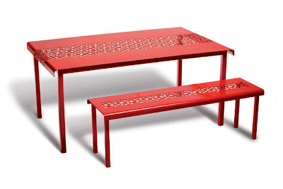
"Tablecloth" my first venture into Outdoor Furniture Design

I have been thinking a lot of late about outdoor furniture and this is the reason why - I have flung myself into the world of furniture design. It came about by accident really - a chance remark by someone and I began to think about it and then I began to look around at outdoor furniture. There was a lot of it and a lot that looked a lot like all the other furniture - wooden or aluminium and synthetic webbing and a bit of glass here and there. While furniture for interiors is awash with colour and imagination I find that outdoor offerings on the whole are not.


"Tablecloth" - detail

So I took the plunge. I know a little bit of madness possessed me but I find I am enjoying myself. So here before you I present a little of my work and a little bit from others who I think do a great job. Some other Australian work and a couple of international pieces which are probably only for those with the deepest pockets. And since I'm self promoting today - you can see more about the furniture and the ideas behind it at www.sudell.com.au

This piece is from Tait - an Australian company who produce some great outdoor furniture - all designed and made in Australia. This is there latest offering entitled Jak & Jil.


I love these - another Australian design the Aura seating system by 2Design. These pebbles can be bought in this delicious stone effect or illuminated - they're comfy and good looking.


Well, I had to include some of the international work - Patricia Urquiola designed this "Tropicalia" setting for Moroso - I love the vibrant colour.

Something a little more restrained in colour (but not design) from Danish designer Louise Campbell.